
LJÓMA
Brand identity and e-commerce brought into one calm, coherent system – Icelandic clarity with precise UX.
Quiet skincare needed a voice that didn't shout. LJÓMA champions minimal formulas and considered routines, so we built an identity and e-commerce experience that mirrors that philosophy – calm, clear, and completely coherent from story to checkout.
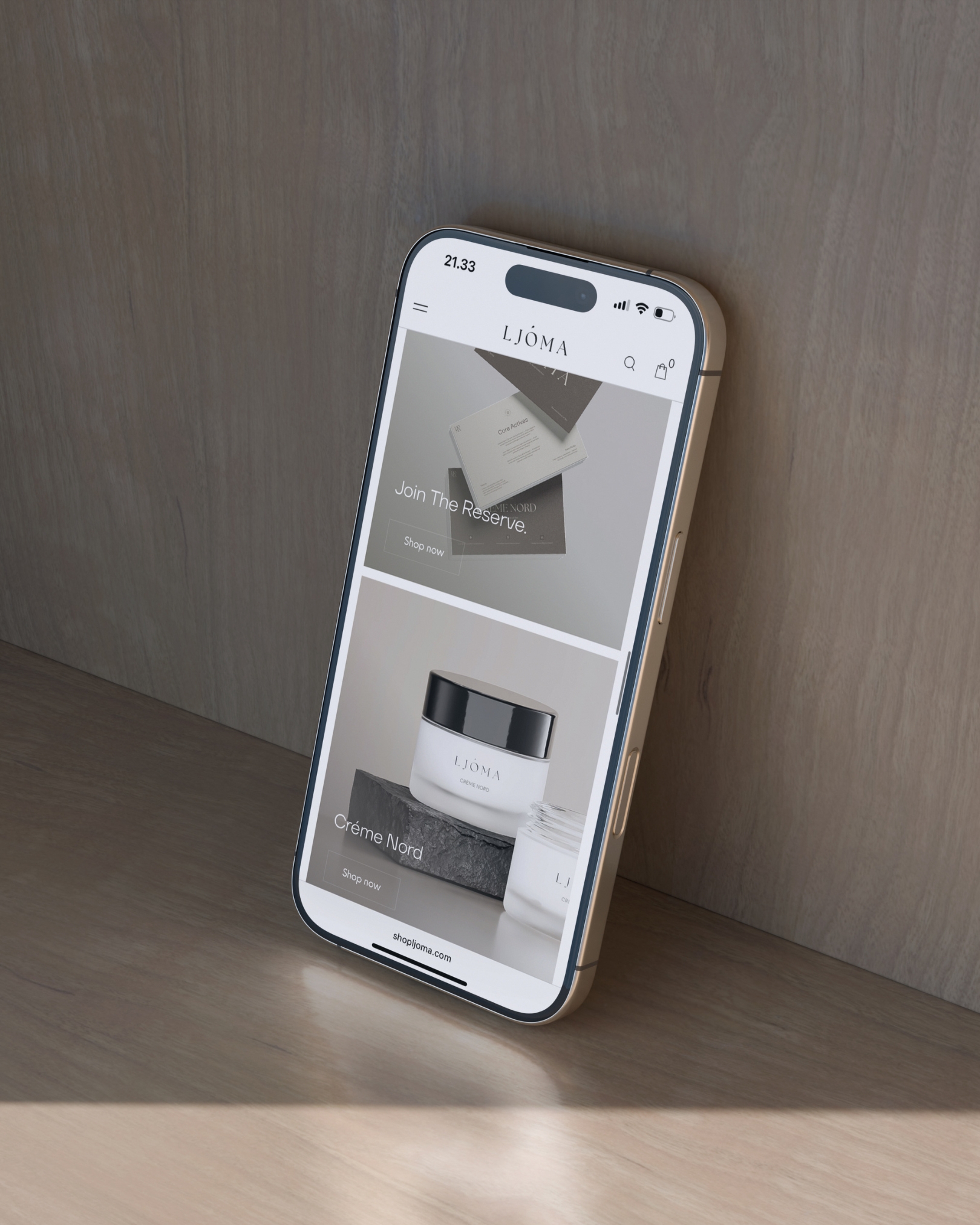
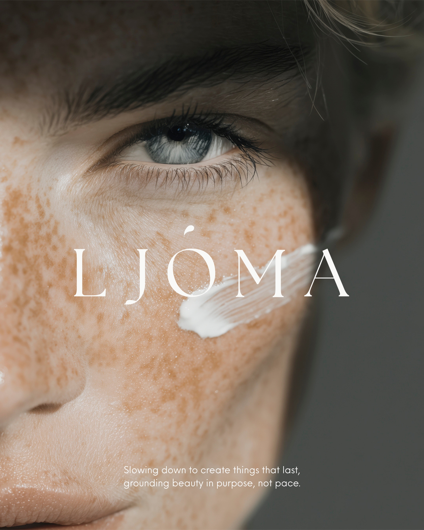
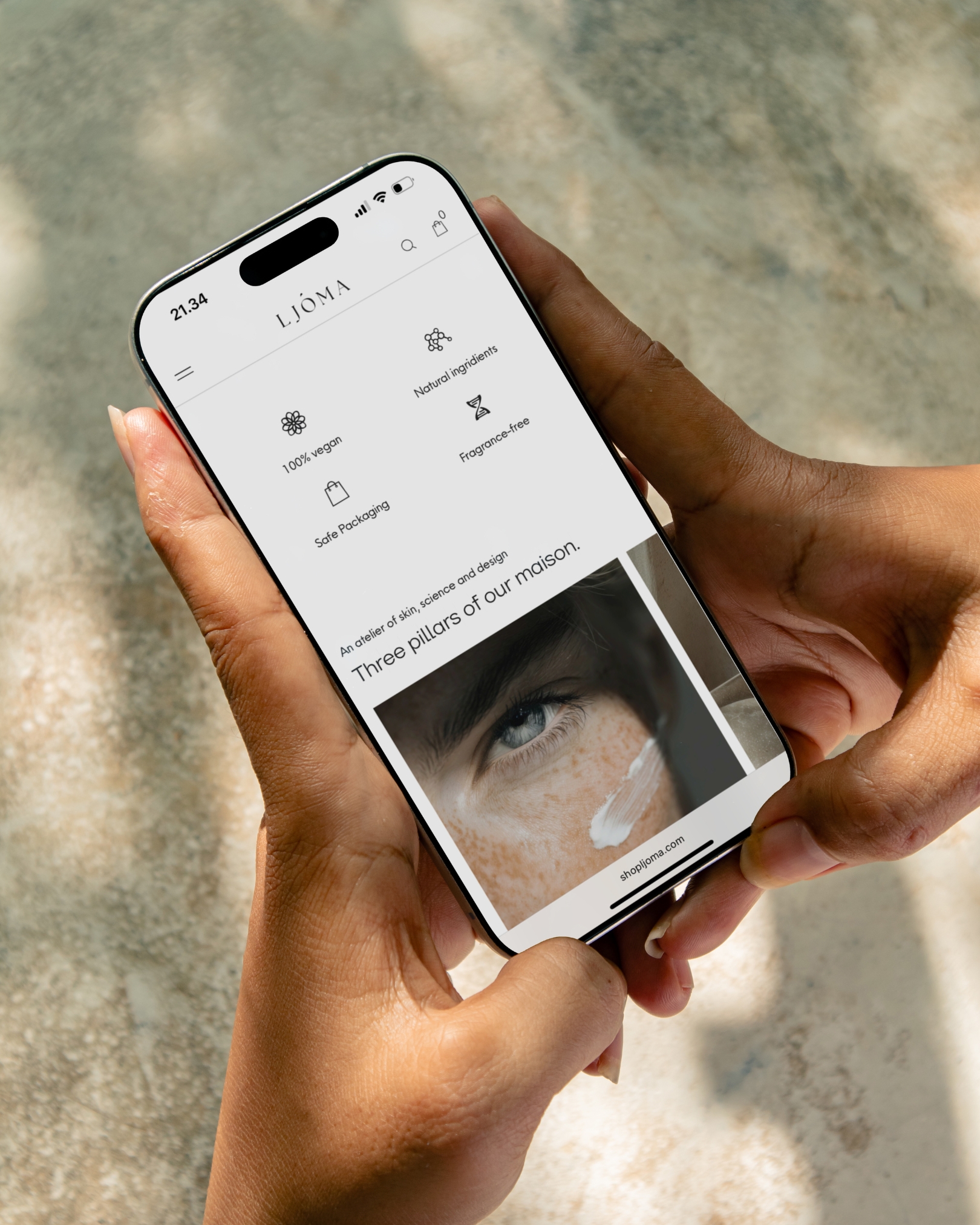
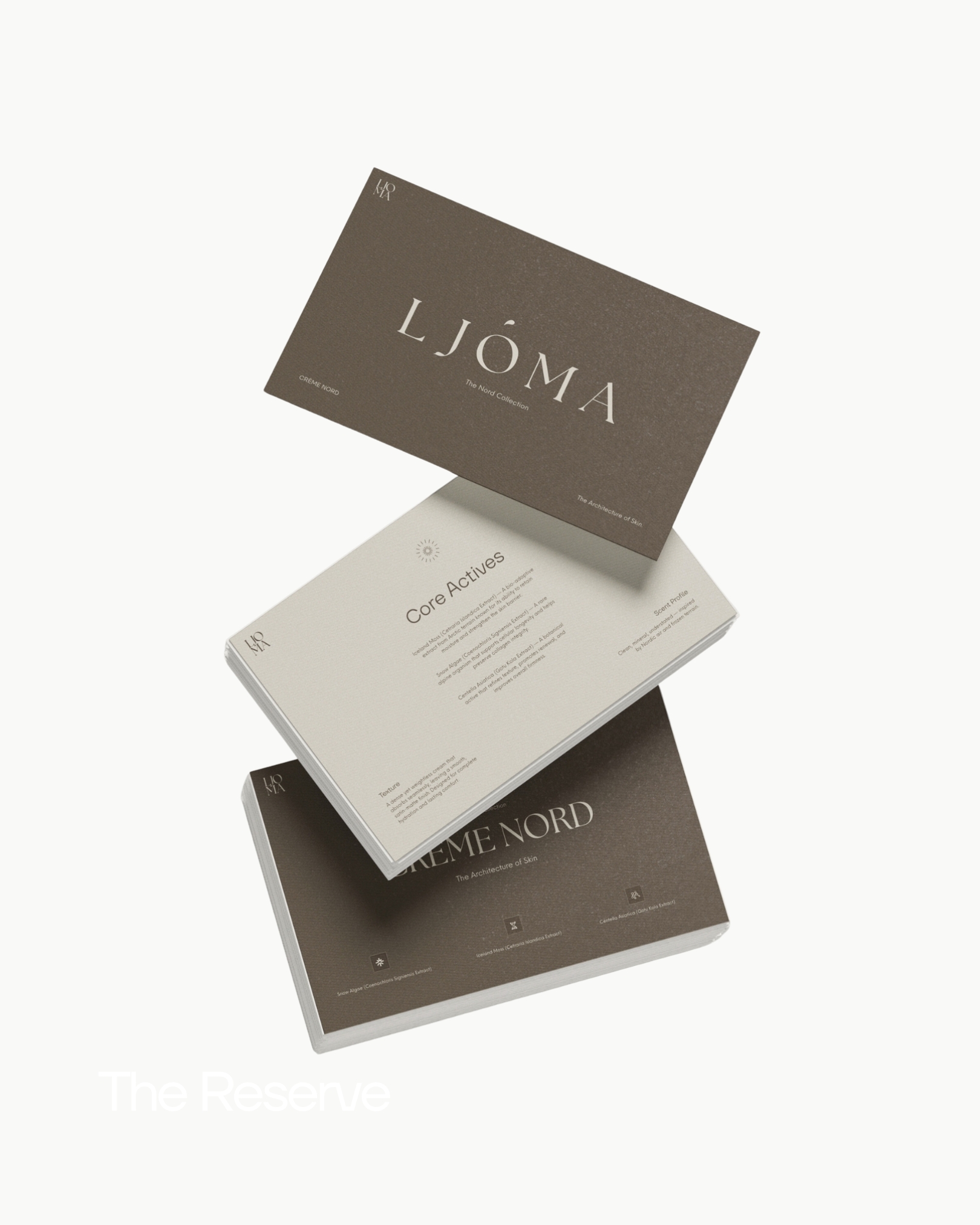
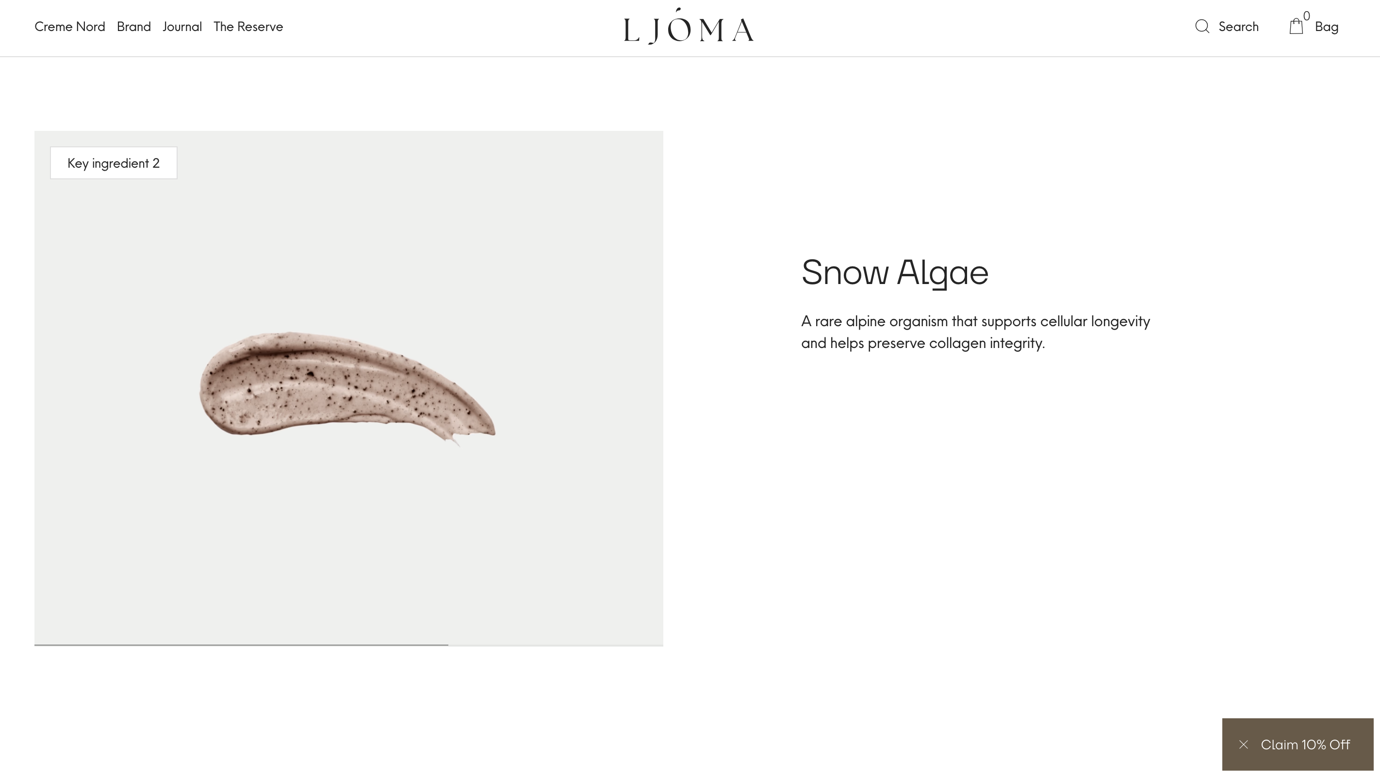
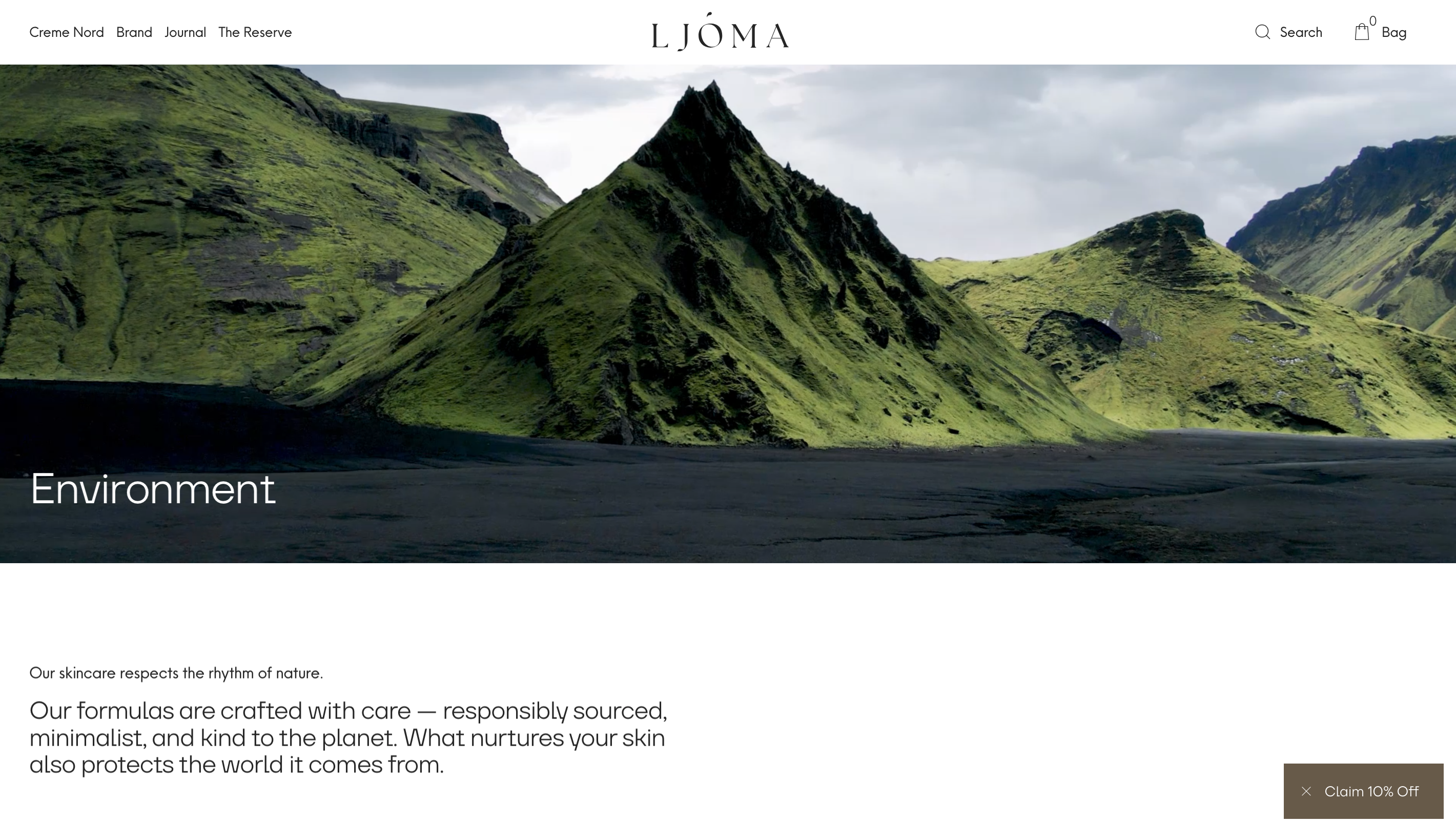
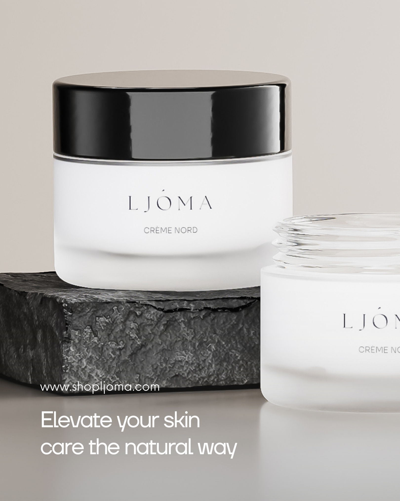
We treated the brand as architecture. A restrained palette of mineral neutrals, macro textures (stone, paper, linen), and generous white space let the products lead. The typography scales cleanly across editorial intros and micro-labels, whilst the grid logic unifies packaging and interface so brand and shop read as one system.
The tone is composed and elemental. Benefits are stated as functions, not hype. Headlines do the minimum ("Cleanse. Strengthen. Protect."); product pages read like short rituals (Use / When / With). Ingredient notes are plain-English and tied to purpose. Every CTA stays neutral and human.
Framer handles speed and narrative; Shopify powers checkout and inventory. The hand-off is invisible – consistent typography, colour tokens and spacing mean the experience never breaks. Modular content blocks (hero, ingredients, routine steps, journal) assemble pages without design drift, and the system scales to launches and seasonal edits without losing its character.
LJÓMA now moves at a human pace. Ingredients are legible, routines are simple, and the route to purchase is a single, calm path. The brand has room to grow whilst staying unmistakably itself.

Let's chat.

Njalsgade 21F, 2. sal
2300 Copenhagen, Denmark
CVR n.: DK45645827
Opening hours
Monday to Thursday
09:00 to 17:00 CET
Friday
09:00 to 15:00 CET