
KONTEXT
Subtraction as a brand system – visual, verbal and spatial design shaped to make silence usable.
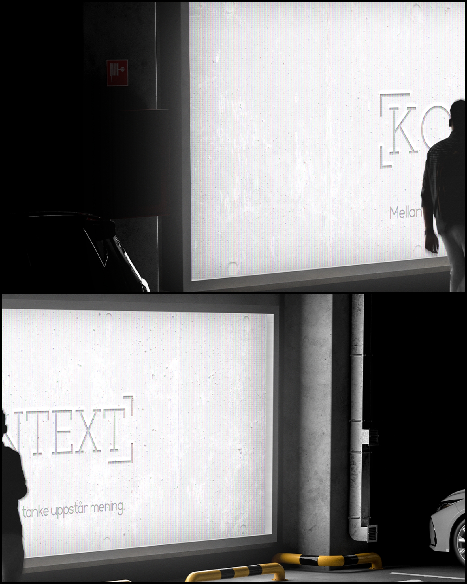
KONTEXT targets guests who treat their minds like precision instruments. Instead of soft comforts, the brand offers a disciplined environment for deep focus. Our task was to express that idea end-to-end – from language and typography to objects, signage and digital presence – so every touchpoint communicates: Mellanrummet talar (the space between speaks).
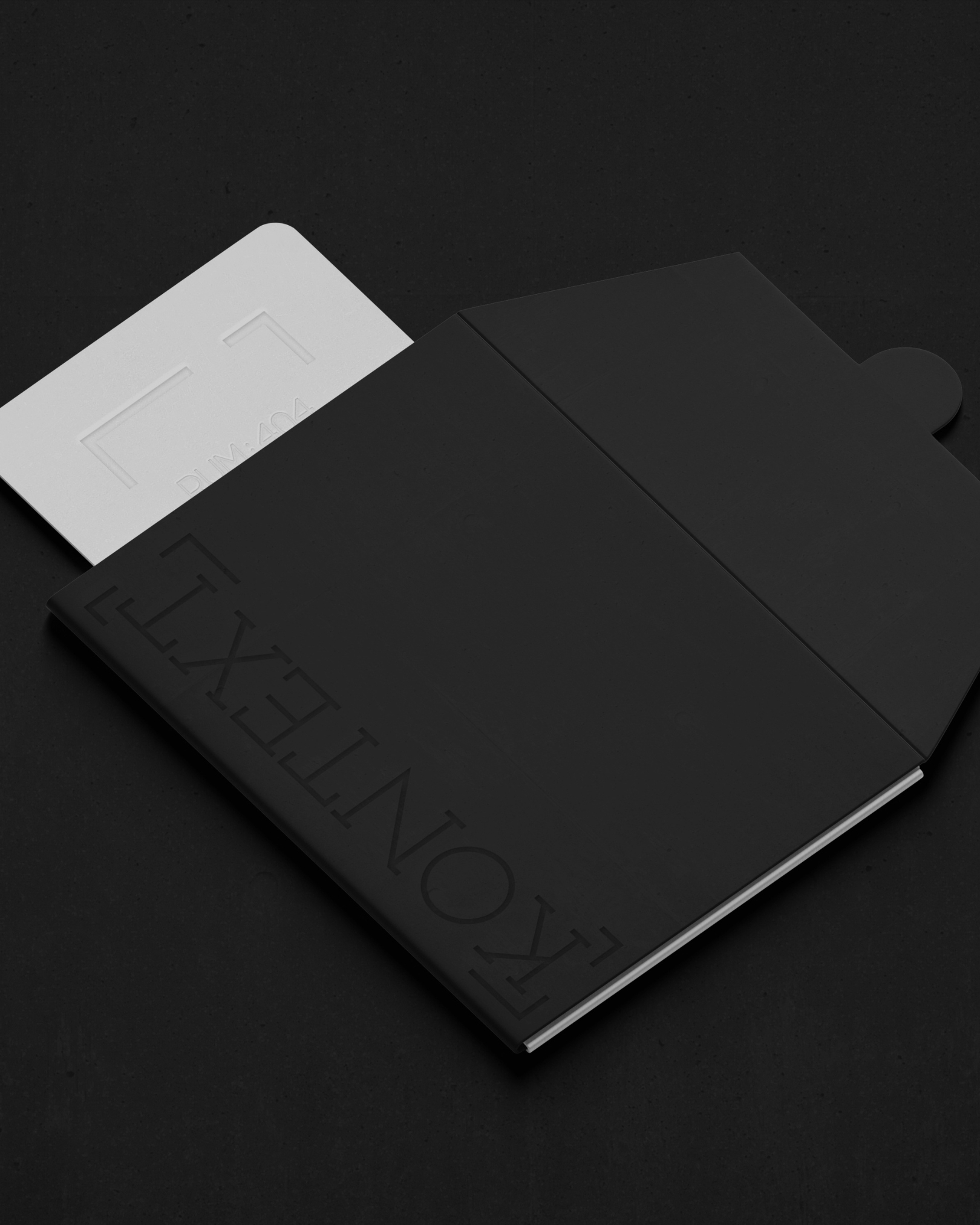
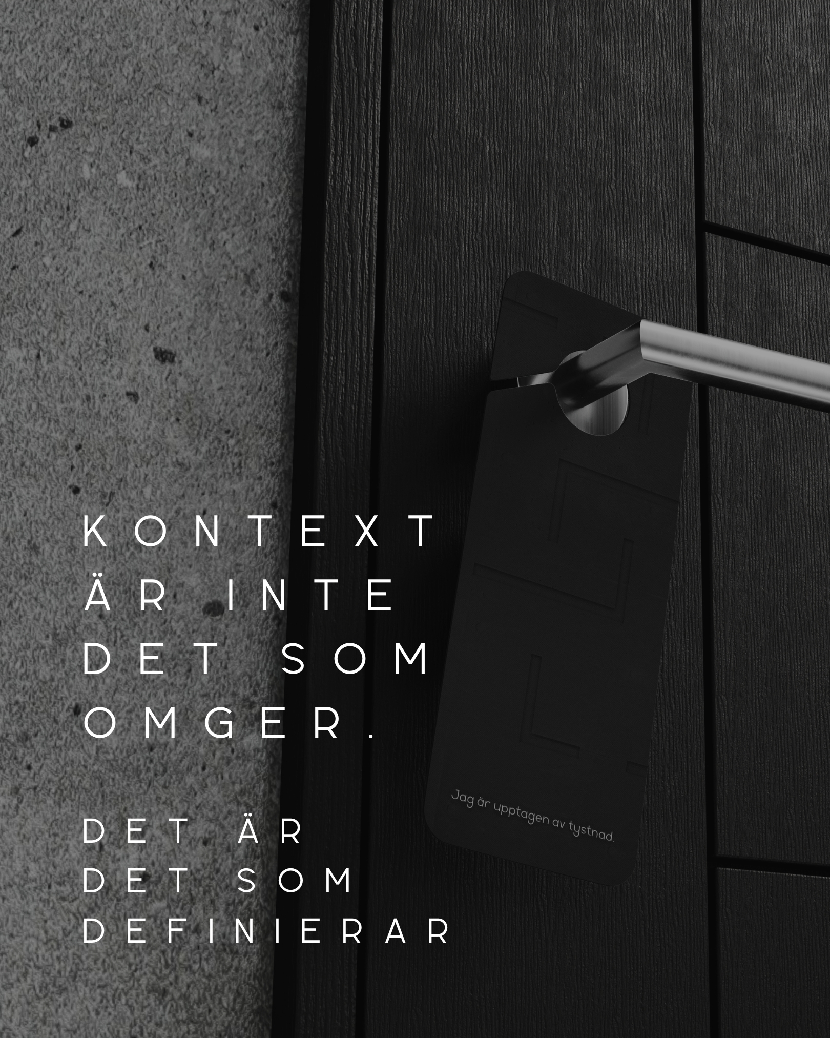
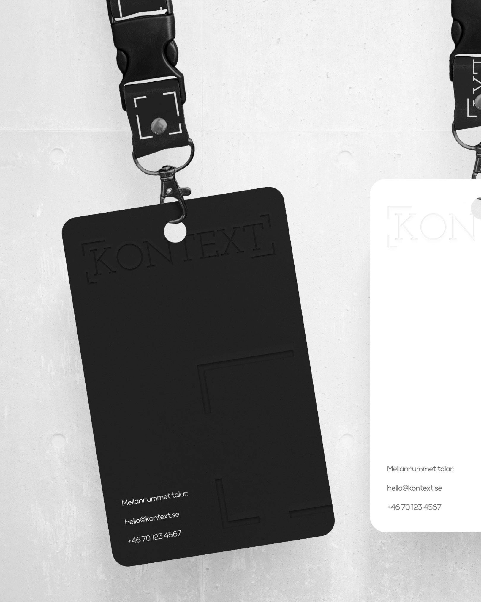
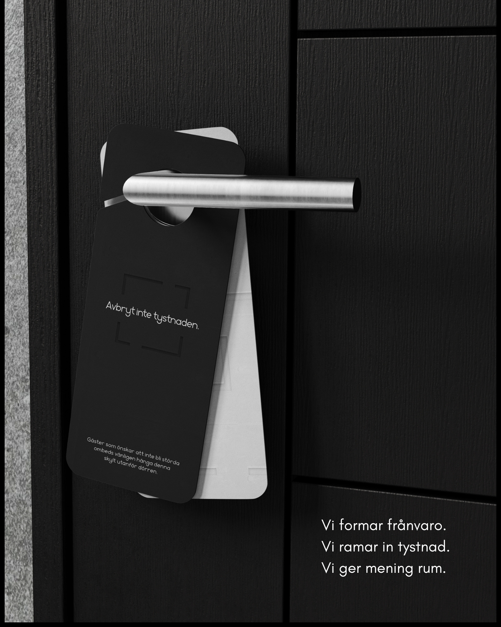
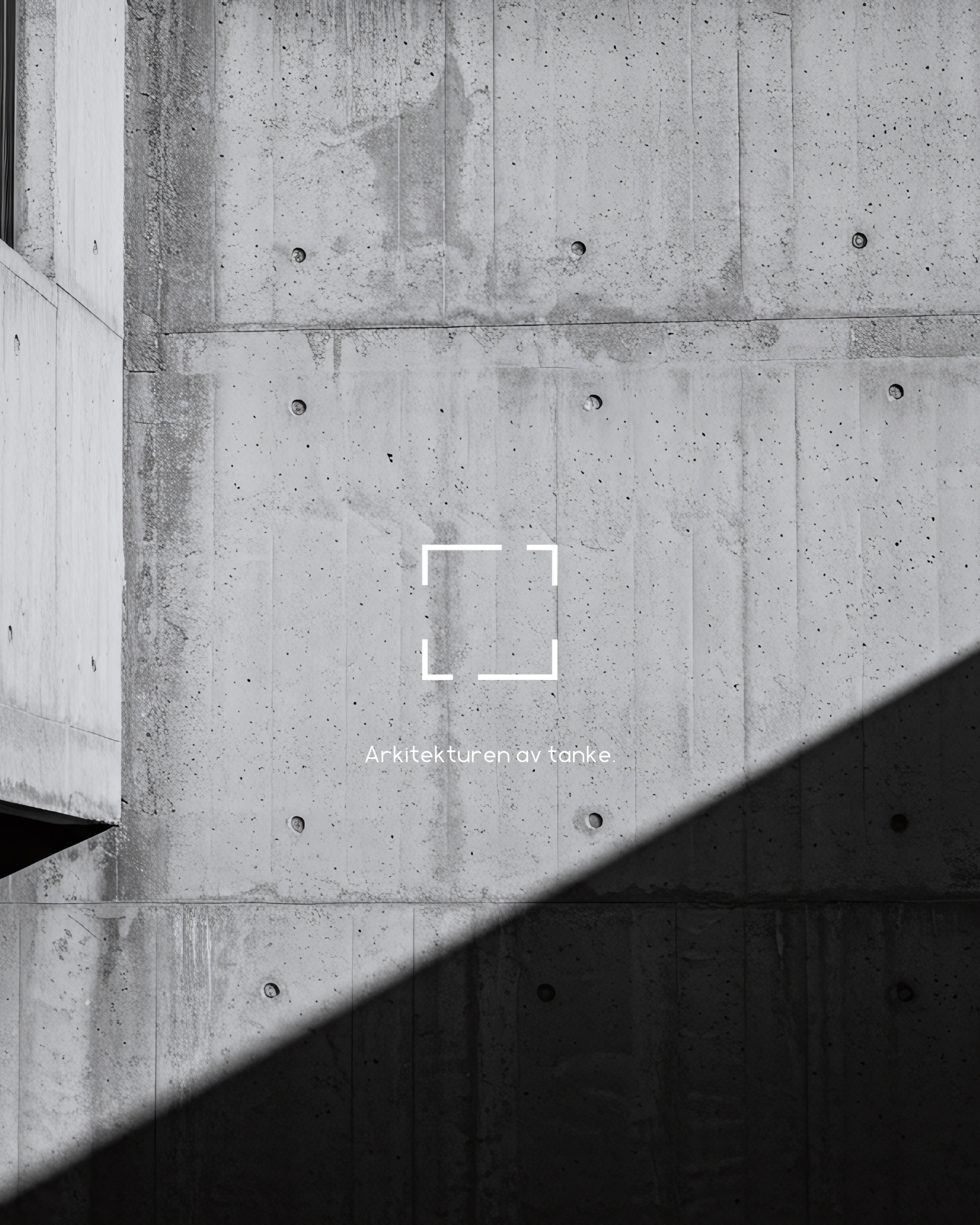
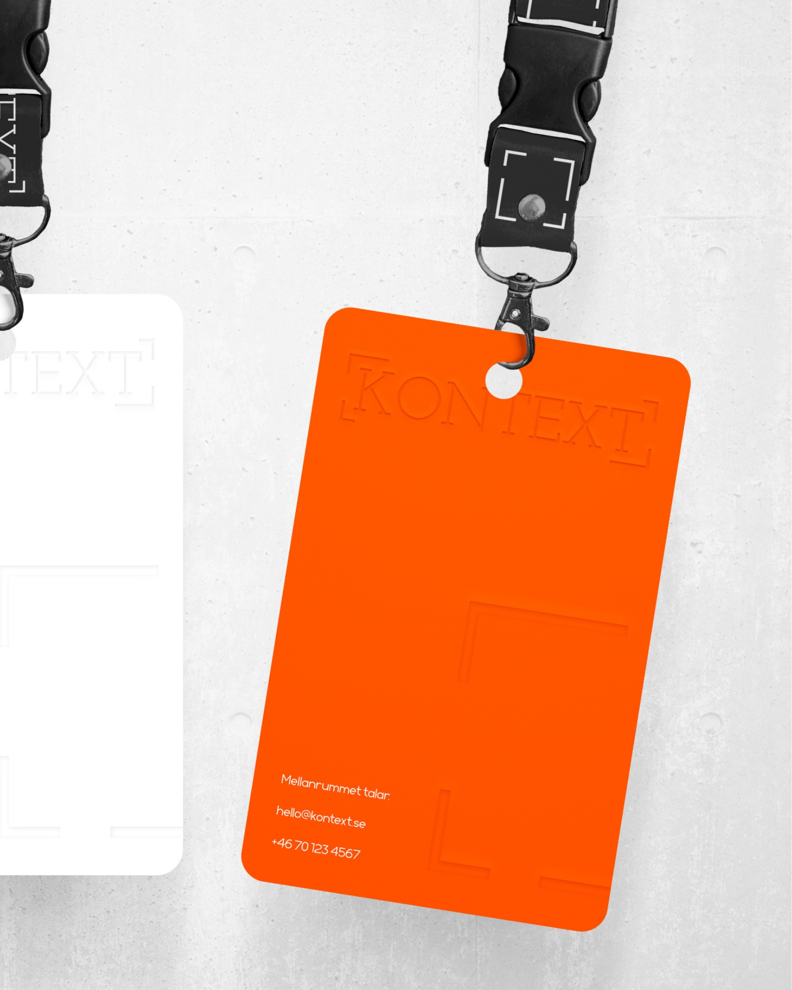
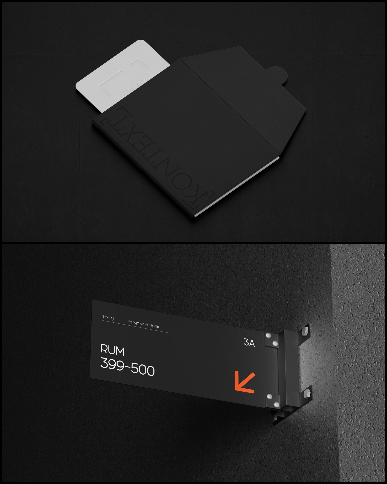
We designed a system that removes noise and frames attention. Raw-concrete black and white form the core palette, with a single signal accent (#ff4d00) used sparingly to direct attention. The framing mark brackets empty space, turning absence into the central graphic idea. A dense, architectural serif anchors headlines whilst supporting text is neutral and highly legible. Generous spacing and strict grids create visual silence.
The tone is composed, precise, humane. Swedish lines appear where authentic – Mellanrummet talar; Avbryt inte tystnaden – paired with clear English guidance. Claims are statements of intent: "Calibrate. Observe. Endure." Copy is short and instructive. Door hangers read "Avbryt inte tystnaden." All signage follows one grid and contrast rule, with materials kept matte and durable to match the building's language.
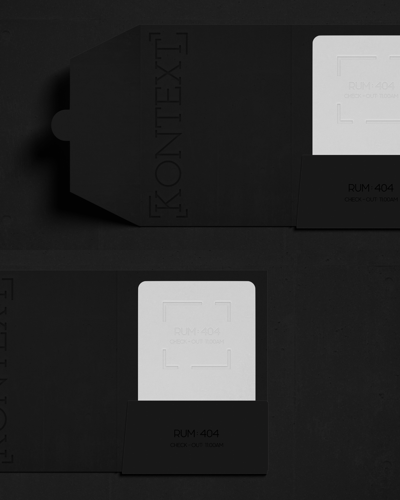
Key-card sleeves, lanyards, business cards and guest notes are designed as quiet objects – deep deboss on black, blind emboss on white, minimal ink. The strict grid and honest materials produce calm without sterility. By filtering for an intellectually minded audience, the brand protects pricing power and aligns expectations before arrival.
KONTEXT reads as a single, coherent system – visual, verbal and spatial working together. Guests are guided, not entertained; silence is protected; attention is framed. A luxury brand that earns its status by helping people think better – not by adding more.

Let's chat.

Njalsgade 21F, 2. sal
2300 Copenhagen, Denmark
CVR n.: DK45645827
Opening hours
Monday to Thursday
09:00 to 17:00 CET
Friday
09:00 to 15:00 CET