
FÆLD
This conceptual project explores how packaging, language, and sensory storytelling can merge into a coherent Nordic brand experience.
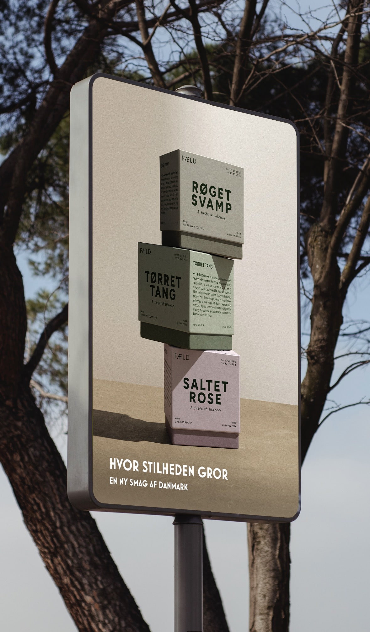
How do you give voice to silence? FÆLD was conceived as a poetic study of Scandinavian design's ability to express nature, stillness, and sensory purity without leaning on cliché. The brand captures foraged Nordic ingredients – seaweed, mushrooms, wild rose – and the quiet landscapes they come from.
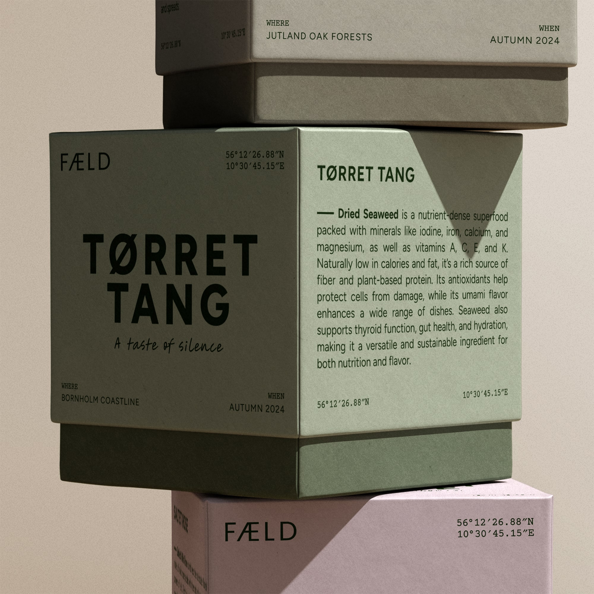
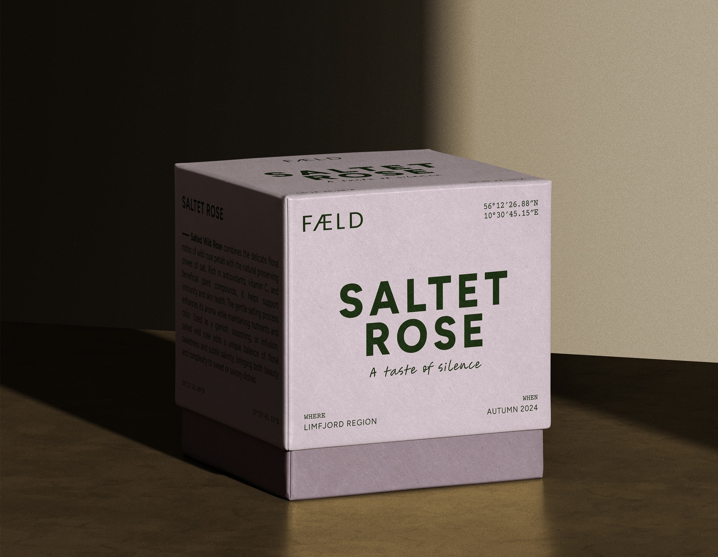
The name reclaims "fælde" (to gather carefully, not to cut down) and the entire identity rests on that balance between stillness and substance. A muted palette of forest green, birch ash, and rose clay echoes Danish coastlines and forest floors. The cubic packaging celebrates precision and calm – design as architecture for taste.
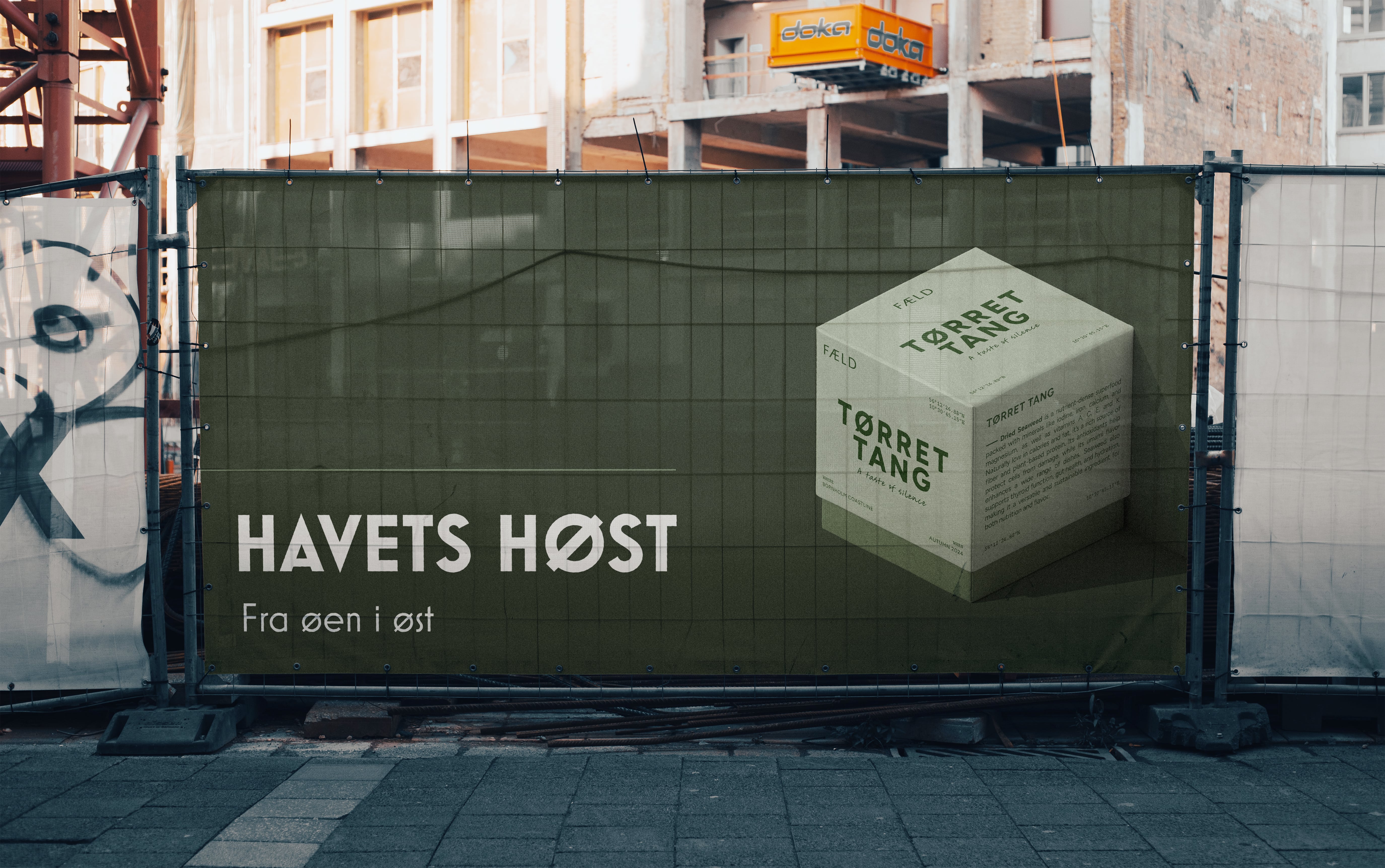
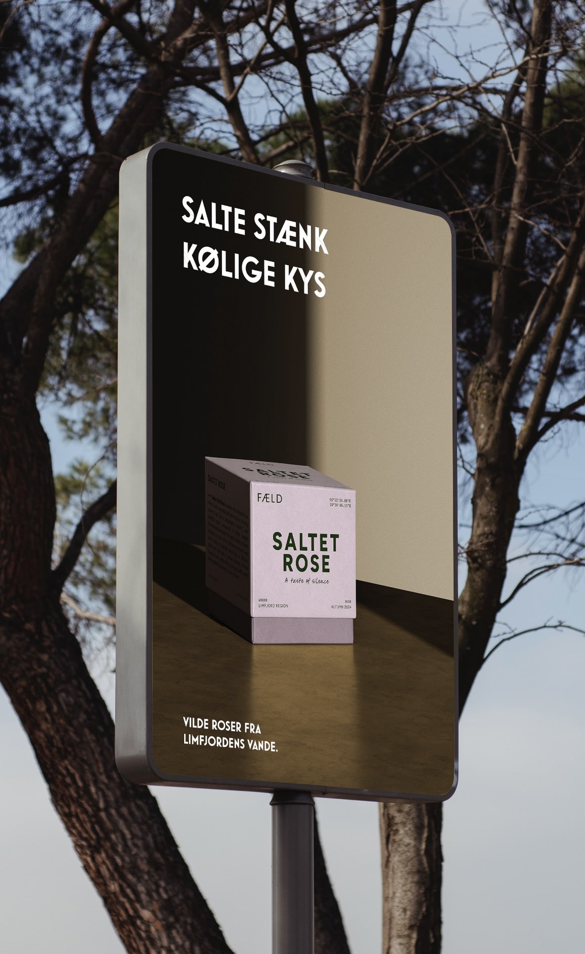
Typography is clean and humanist. Monospaced coordinates reference real origins, tying every box to a specific landscape. The copywriting mirrors the sensory minimalism of the visuals. The tagline – Hvor stilheden gror (Where stillness grows) – and the subline En ny smag af Danmark (A new taste of Denmark) position FÆLD as a quiet counterpoint to noisy consumerism. Each product line deepens the narrative: Tørret Tang: Havets høst fra øen i øst (The sea's harvest from the island in the east).
The campaign was designed for metro and city boards – typographic minimalism and poetic rhythm replacing traditional product marketing. FÆLD proves that sustainability can look sensuous, not rustic, and that packaging can be poetry. Through this project, Nørd Studio demonstrates its capacity to blend design, language, and sustainability into one sensory experience – a new taste of Denmark.


Let's chat.

Njalsgade 21F, 2. sal
2300 Copenhagen, Denmark
CVR n.: DK45645827
Opening hours
Monday to Thursday
09:00 to 17:00 CET
Friday
09:00 to 15:00 CET