

Dønning
A conceptual project showcasing strategic and design capabilities for the mental wellness industry.
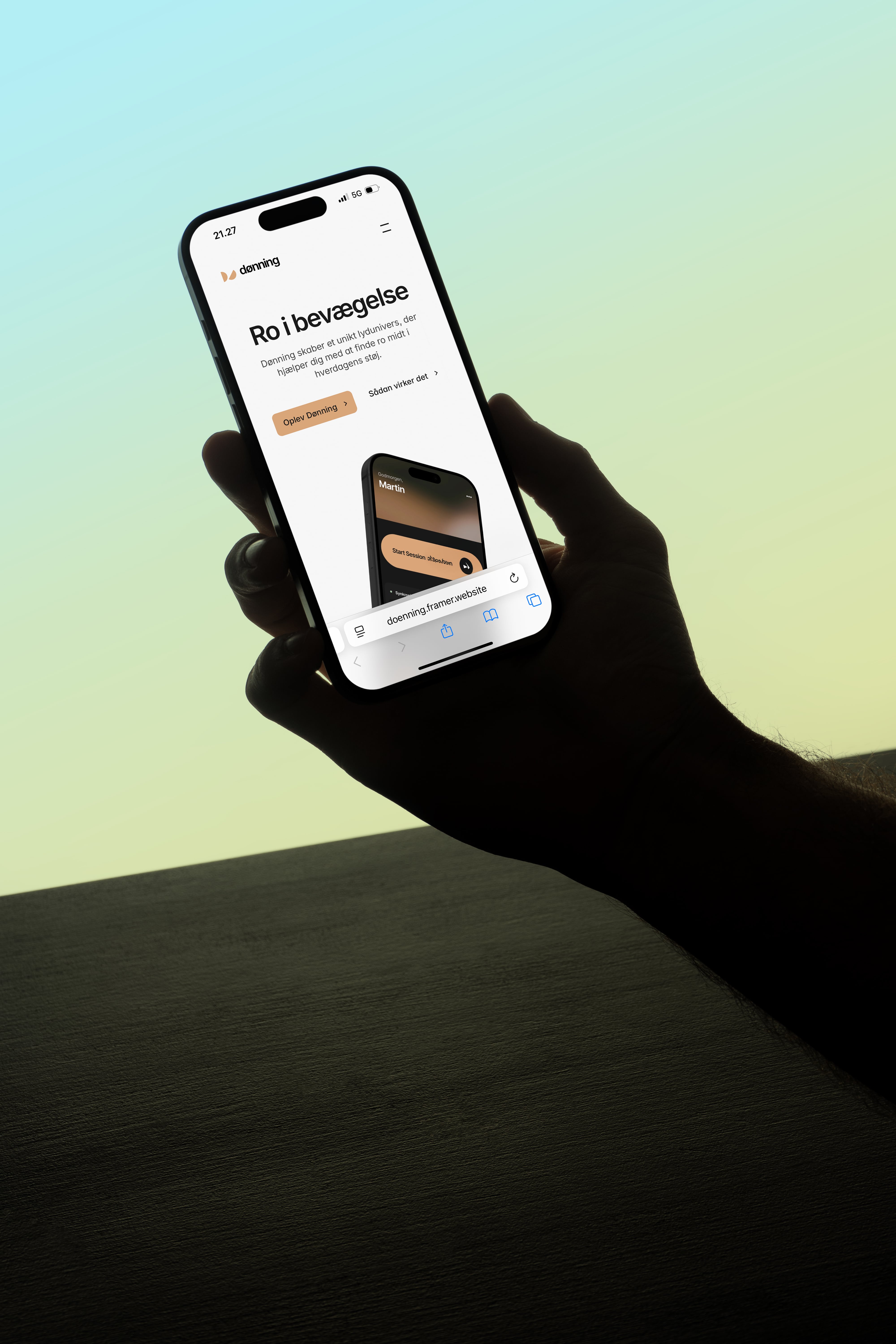
The modern wellness market is cold and sterile. Our challenge was to design a homepage for Dønning – an app using complex physiological data to create personalised, real-time soundscapes – and prove that high-tech innovation could be presented with the emotional comfort of Scandinavian design. To make an algorithm feel like hygge.
We embraced the paradox of technology and nature. The name Dønning (Danish for a long, slow ocean swell) became our foundational metaphor – sustained, gentle movement. We chose a warm orange and brown palette, deliberately moving away from typical wellness blues and greens, instantly evoking hygge and emotional comfort. The hero section uses subtle, fluid animations to visualise the swell, representing the app's core feature: Ro i bevægelse (Calm in Motion).
We paired the screen-optimised Inter typeface with AI-generated visuals grounding the app in beautiful, aspirational Scandinavian interiors – connecting the digital tool to a quality lifestyle. Built on Framer, the site uses sticky scrolling and fluid transitions to create a premium, seamless experience. The sophisticated copywriting and unexpected colour palette elevate Dønning beyond mass-market wellness apps whilst the "How it Works" section clearly explains the complex technology without overwhelming.
The Dønning concept provides a robust blueprint for brands combining sophisticated data with genuine user comfort. We successfully translated complex innovation into a clear, cohesive, and compelling visual identity. Softness engineered. Calm, digitised.


Let's chat.

Njalsgade 21F, 2. sal
2300 Copenhagen, Denmark
CVR n.: DK45645827
Opening hours
Monday to Thursday
09:00 to 17:00 CET
Friday
09:00 to 15:00 CET